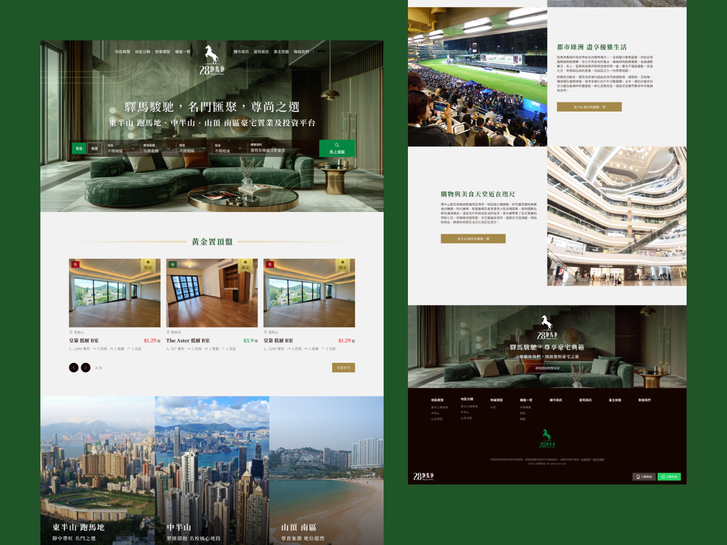
Web UI/UX Design | Branding Design
28 Happy Valley
- Proptech
- Luxury Residences
Role(s)
Lead Brand Strategist & UX/UI Designer
Platform
Web UI/UX Design | Branding Design
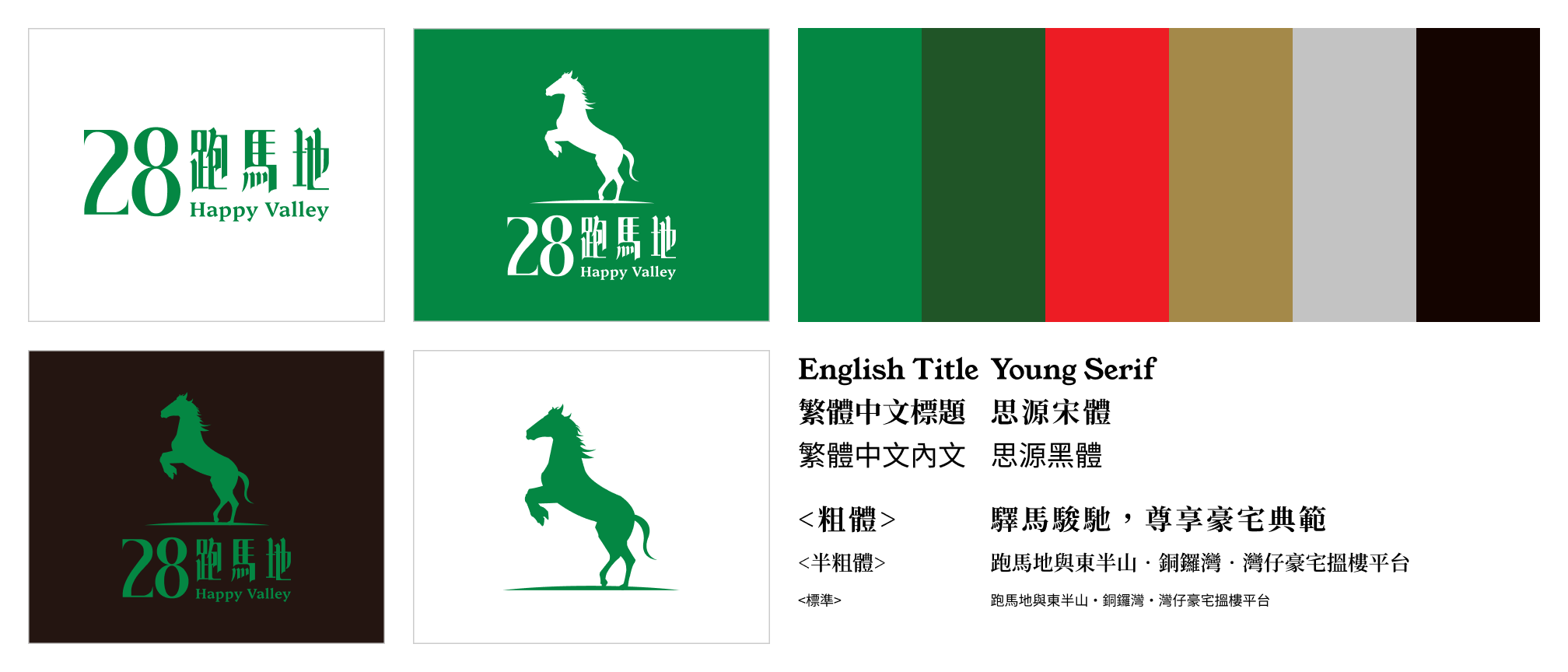
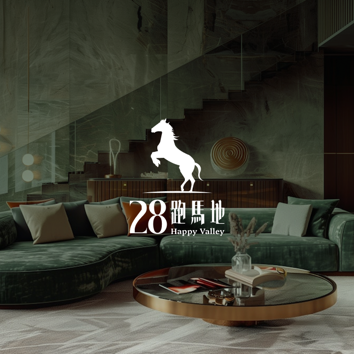
We anchored the brand in the Ruler archetype, communicating authority, legacy, and stability—key values for luxury real estate. The narrative was directly inspired by the heritage of Happy Valley itself.
The Chinese name for Happy Valley, "跑馬地", means "racecourse." We chose the emblem of a horse with its front legs raised high—a powerful symbol in both equestrian and Chinese cultural contexts. This represents:
This logo wasn't just an image; it was the embodiment of the client's and their clients' aspirational journey.
The color palette was designed to complement the logo’s symbolism and root the brand in its luxurious environment.